Design System
Design System
Nebula UI
Nebula UI
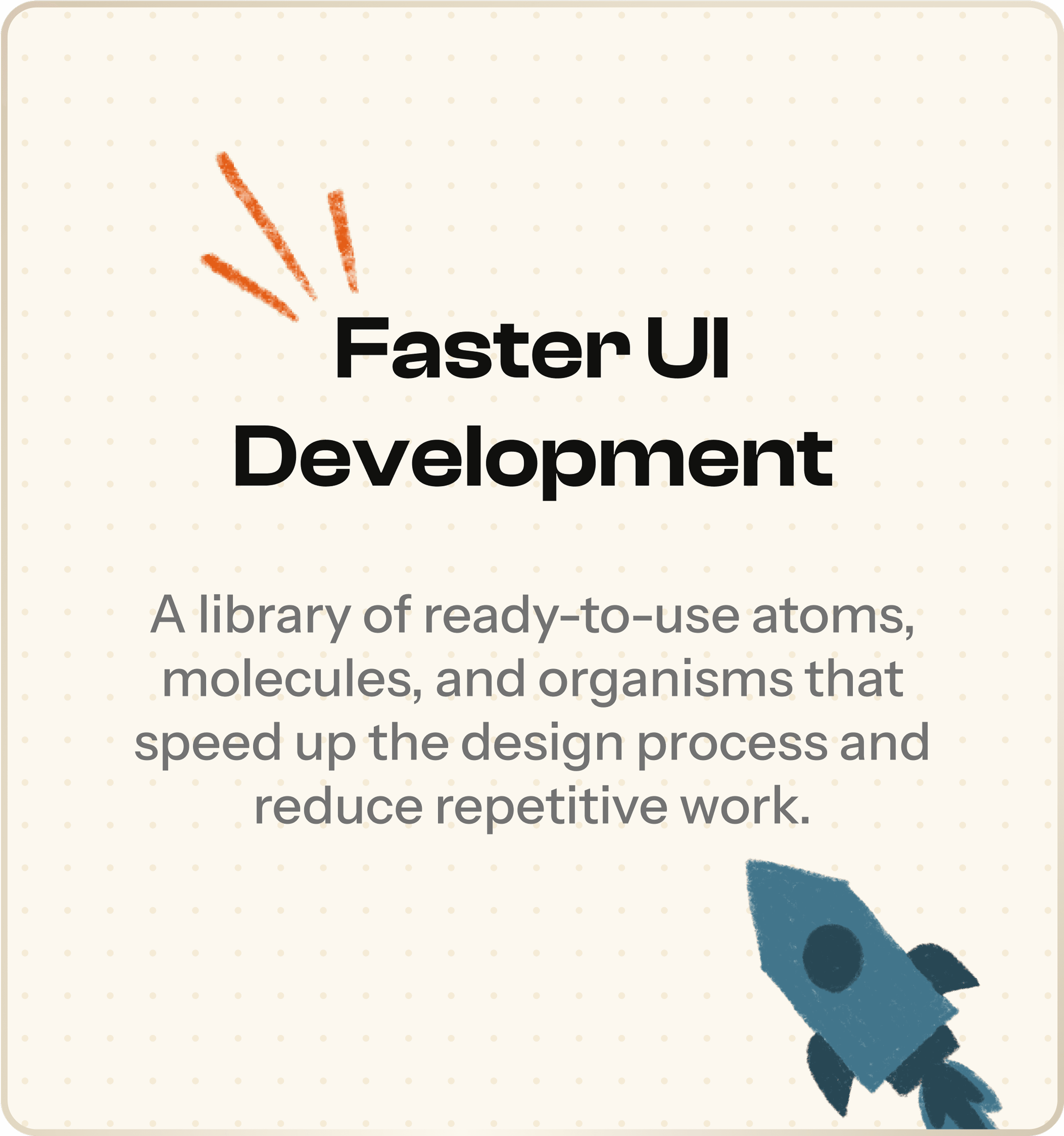
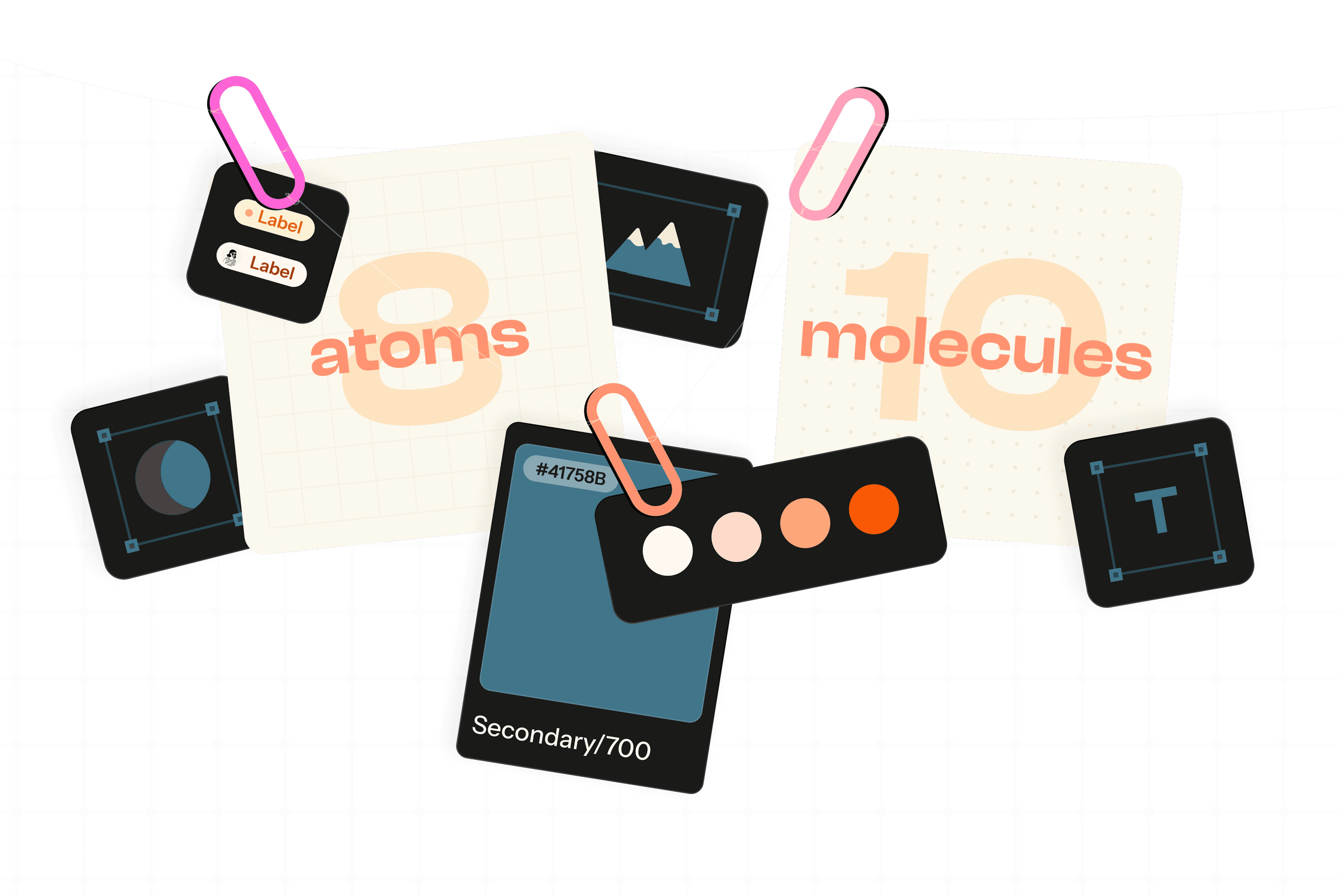
Atoms
8
Molecules
10

About Nebula UI
Building a scalable design
system in Figma
Building a scalable design
system in Figma
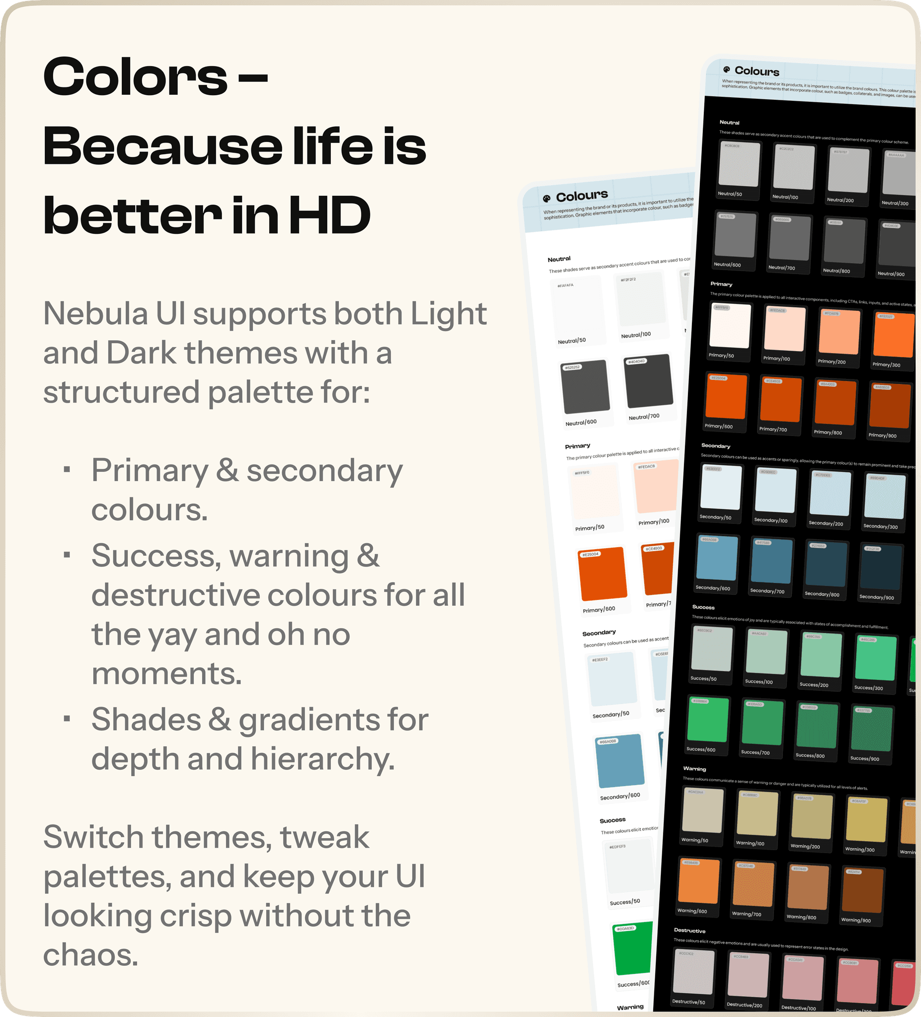
Nebula UI is a flexible, scalable, and easy-to-use design system built in Figma to simplify digital product design. It eliminates inconsistencies, speeds up the design process, and ensures a cohesive user experience across projects.
With predefined styles, local variables, and reusable components, Nebula UI makes UI creation effortless—whether you’re building a small app or a large-scale product. Plus, its clear documentation and beginner-friendly structure mean that even new designers can jump in without confusion.
Designed for adaptability, efficiency, and consistency, Nebula UI takes the guess work out of UI design, letting designers focus on creating great experiences.
Brief
Problem
Statement
Problem
Statement
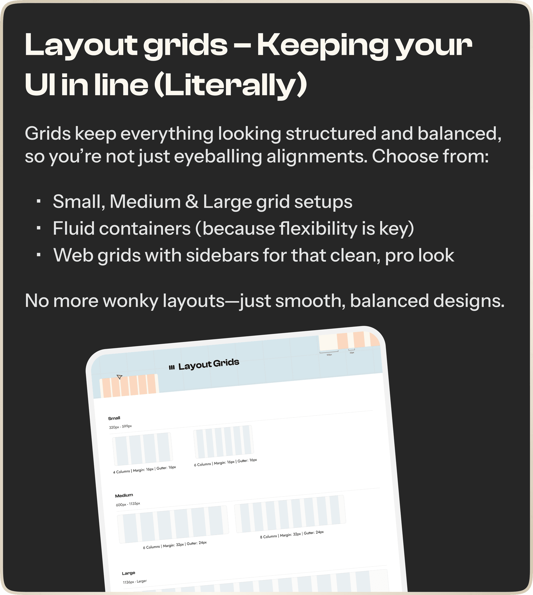
Designing user interfaces from scratch can be time-consuming, inconsistent, and frustrating—especially when scaling across multiple projects. Nebula UI solves this by providing a structured, adaptable design system that ensures consistency, efficiency, and ease of use for designers at any level. Here’s what you get:
Designing user interfaces from scratch can be time-consuming, inconsistent, and frustrating—especially when scaling across multiple projects. Nebula UI solves this by providing a structured, adaptable design system that ensures consistency, efficiency, and ease of use for designers at any level. Here’s what you get:


Starting with the smallest elements
Atoms in
Nebula UI
Atoms in
Nebula UI
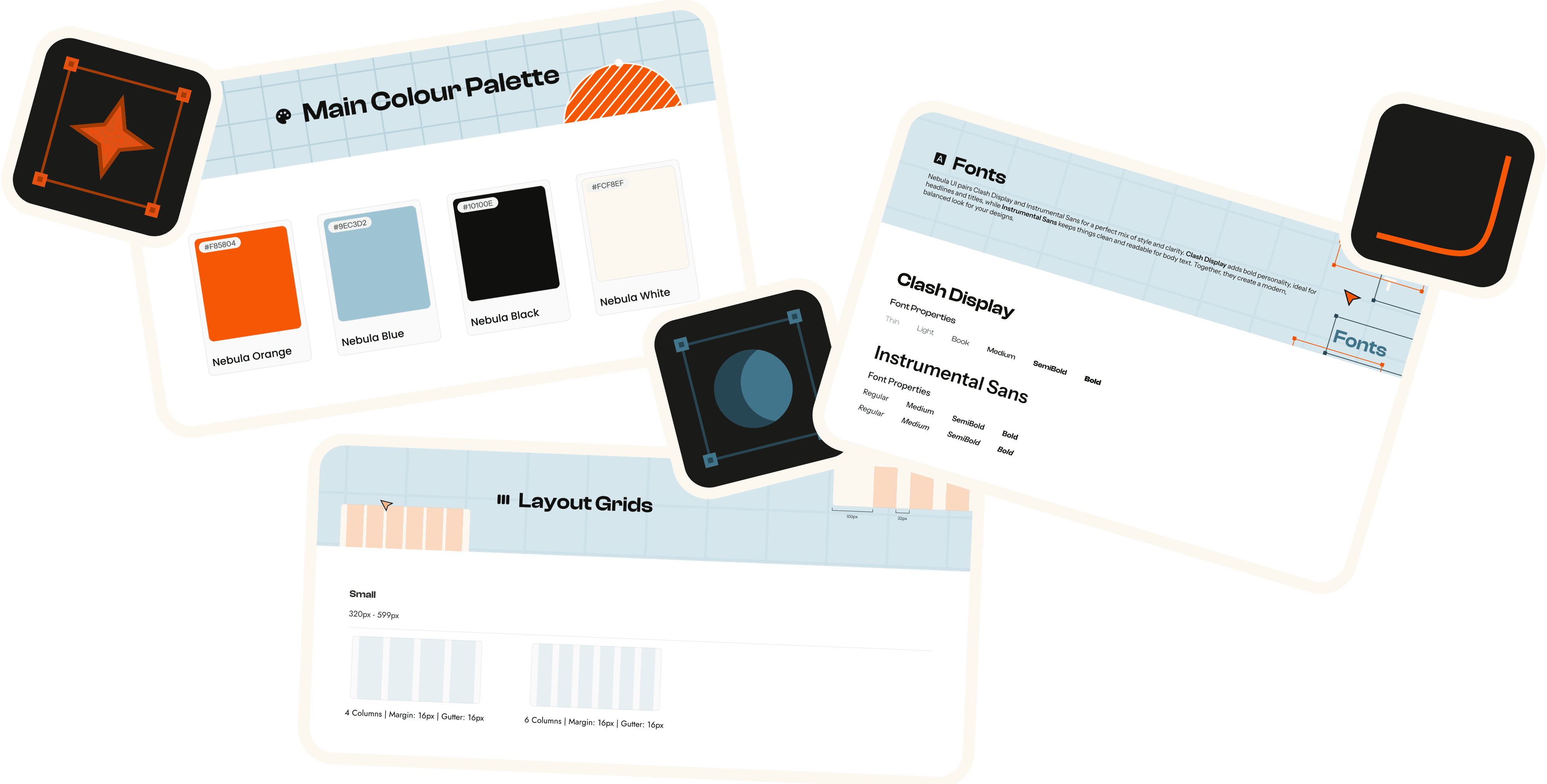
Nebula UI follows Atomic Design principles, meaning everything starts with the smallest elements—atoms—which form the foundation of all UI components.
Each atom in Nebula UI is created using Figma variables, making customisation effortless and ensuring scalability across projects.
Nebula UI follows Atomic Design principles, meaning everything starts with the smallest elements—atoms—which form the foundation of all UI components.
Each atom in Nebula UI is created using Figma variables, making customisation effortless and ensuring scalability across projects.


When atoms join forces
Molecules
Atoms are great on their own, but when they team up, magic happens. Enter Molecules—small, reusable UI components that bring structure, functionality, and a whole lot of style to your designs.
These are the power duos & trios of Nebula UI, designed to be plug-and-play so you don’t have to reinvent the wheel every time.
Wrapping it up
Why Nebula UI?
Why Nebula UI?
Nebula UI isn’t just a design system—it’s a faster, smarter, and more structured way to build interfaces. With its atomic design foundation, scalable components, and built-in flexibility, it takes the guesswork out of UI design.
Whether you're working on a small app or a large-scale product, Nebula UI keeps things consistent, customisable, and easy to use—so you can spend less time fixing inconsistencies and more time creating great experiences.
More than just components
The Learning Curve
The Learning Curve
Building Nebula UI wasn’t just about putting together a set of components—it was a deep dive into design systems, structure, and scalability. What started as an experiment turned into a well-thought-out system that balances consistency, flexibility, and ease of use.
Building Nebula UI wasn’t just about putting together a set of components—it was a deep dive into design systems, structure, and scalability. What started as an experiment turned into a well-thought-out system that balances consistency, flexibility, and ease of use.


When atoms join forces
Molecules
Atoms are great on their own, but when they team up, magic happens. Enter Molecules—small, reusable UI components that bring structure, functionality, and a whole lot of style to your designs.
These are the power duos & trios of Nebula UI, designed to be plug-and-play so you don’t have to reinvent the wheel every time.


Start
1
3

User research
My Role
Research & App design
Quantitative & Qualitative Analysis
Competitor analysis
& wireframes
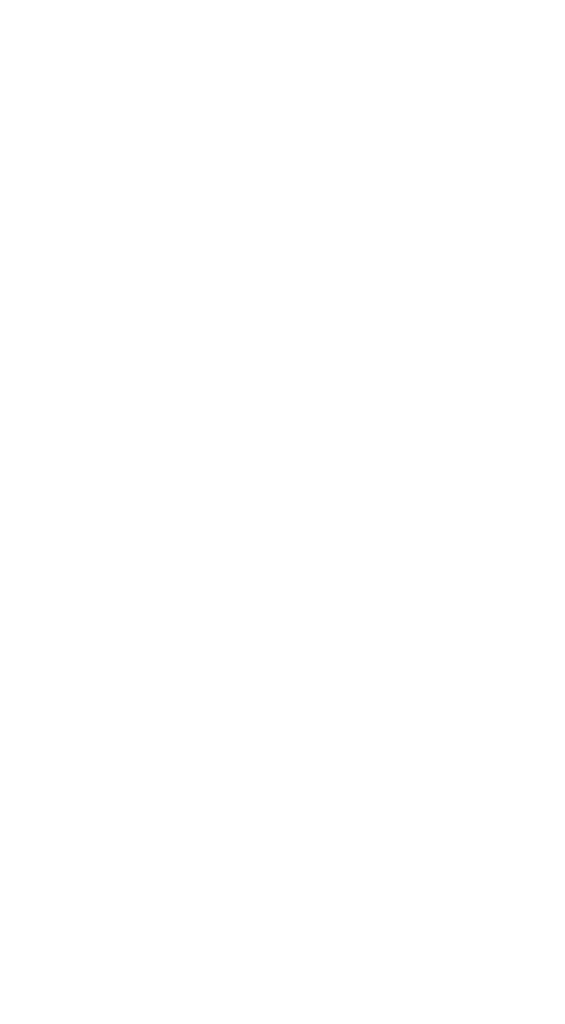
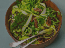
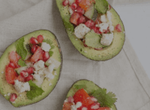
Creating a recipe app for personalised cooking 🥘
08/2022 - 10/2022
The recipe app simplifies meal planning by offering personalised recipes, nutritional info, and portion control, tailored to users' skills, preferences, and dietary needs.
Hi, Addie!
Recipes designed for you!
Veg
Search recipe
Today’s menu
Green salad
15 mins
4.7
200 Cals
This green salad is good for a side dish or a meal on its own. I make it often... view more
Stuffed avocado
40 mins
4.7
263 Cals
Full of creaminess and healthy fats, avocados are a wonderful addition to you...view more
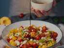
Chickpea salad
15 mins
4.7
167 Cals
Chickpea salad is easy to make and comes together fast. It’s perfect for lun...view more
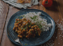
Chole chawal
15 mins
4.7
200 Cals
Skillet rice and chickpeas is a classic Middle Eastern dish that is easy to mak... view more

Chia seeds rose milk
15 mins
4.7
152 Cals
Easy to make with just three Ingredients. A must try drink in this summer...view more
Popular
Cherry tomato salad
45 mins
4.9
500 Cals
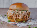
Burger
60 mins
4.7
400 Cals
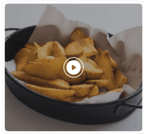
Potato wedges
Veg
The blended oat flour is essential to the added chewy texture, and the molasses in brown sugar makes it a mor... view more
45 min.
260 cal
2
INGREDIENTS
NUTRITION
Potato
500gm
Paprika
3/4 teaspoon
Black pepper
1/4 teaspoon
Garlic powder
1 teaspoon
Onion powder
1 teaspoon
Salt
3/4 teaspoon
Thyme
1/4 teaspoon
Oregano
1/4 teaspoon
Basil
1/4 teaspoon
Corn starch
2 tablespoons
Add to shopping list
Steps
1
Soak and scrub 500 grams potatoes (1/2 kg) well with a brush and rinse them well under running water. This helps to get rid of the dirt and mud on the potatoes.
2
Cut each potato lengthwise to 2 parts. I prefer to keep the skin. If you don’t like you may peel it.
3
Then slice each part to 3 to 4 wedges depending on the size of the potato.
4
Add them to a bowl of cold water. Rest them for 30 mins. I had varying results when I skipped this step. You may experiment with and without soaking. I prefer this step. After 30 mins, drain water from the potatoes completely.
5
Measure all the seasonings and keep aside.
6
Mix all of the spices first and taste test. Add more salt if needed.
7
Check the instructions below to deep fry. The method to follow for deep frying is different so scroll down for that and skip steps 7 to 14. Preheat the oven or air fryer to 220 C or 400 F. Grease or line a baking tray. Keep it aside.
8
Drain water from the potatoes completely and wipe them dry with a kitchen towel. I let mine air dry.
9
Then pour 2 tablespoons oil and coat them well.
10
Sprinkle the seasoning prepared earlier. Coat all of the potatoes well with the seasoning. A lot of seasoning settles down at the bottom of the bowl. Mix well and coat them evenly.
11
If the seasoning is too dry then sprinkle more oil if baking. If using air fryer, then you may sprinkle water.
12
To air fry, just add them to the basket and spread them. The first option is to choose the default fries setting and then towards the end air fry at highest 200 C or 400 F until crisp and golden for 2 to 3 mins. The second method is to air fry at 200 C or 400 F for 8 to 9 mins and then shake them once and repeat for another 8 to 9 mins until crisp and golden.
More recipes

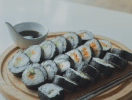
Ramen
45 mins
4.9
500 Cals

Pancake
30 mins
4.4
230 Cals
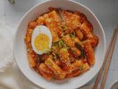
Tteokbokki
45 mins
4.9
500 Cals
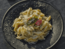
White sauce pasta
60 mins
4.7
400 Cals

Momos
45 mins
4.9
500 Cals
Avocado salad
15 mins
4.7
200 Cals

Chicken biryani
45 mins
4.9
500 Cals
Burger
60 mins
4.7
400 Cals
Taco
45 mins
4.9
500 Cals
Sushi
60 mins
4.7
400 Cals
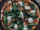
Pizza
45 mins
4.9
500 Cals
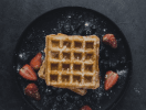
Waffle
60 mins
4.7
400 Cals

Home screen
Recipe screen
Check out the dark mode!
Try it out!

2
Figma variables
My Role
Research & Design
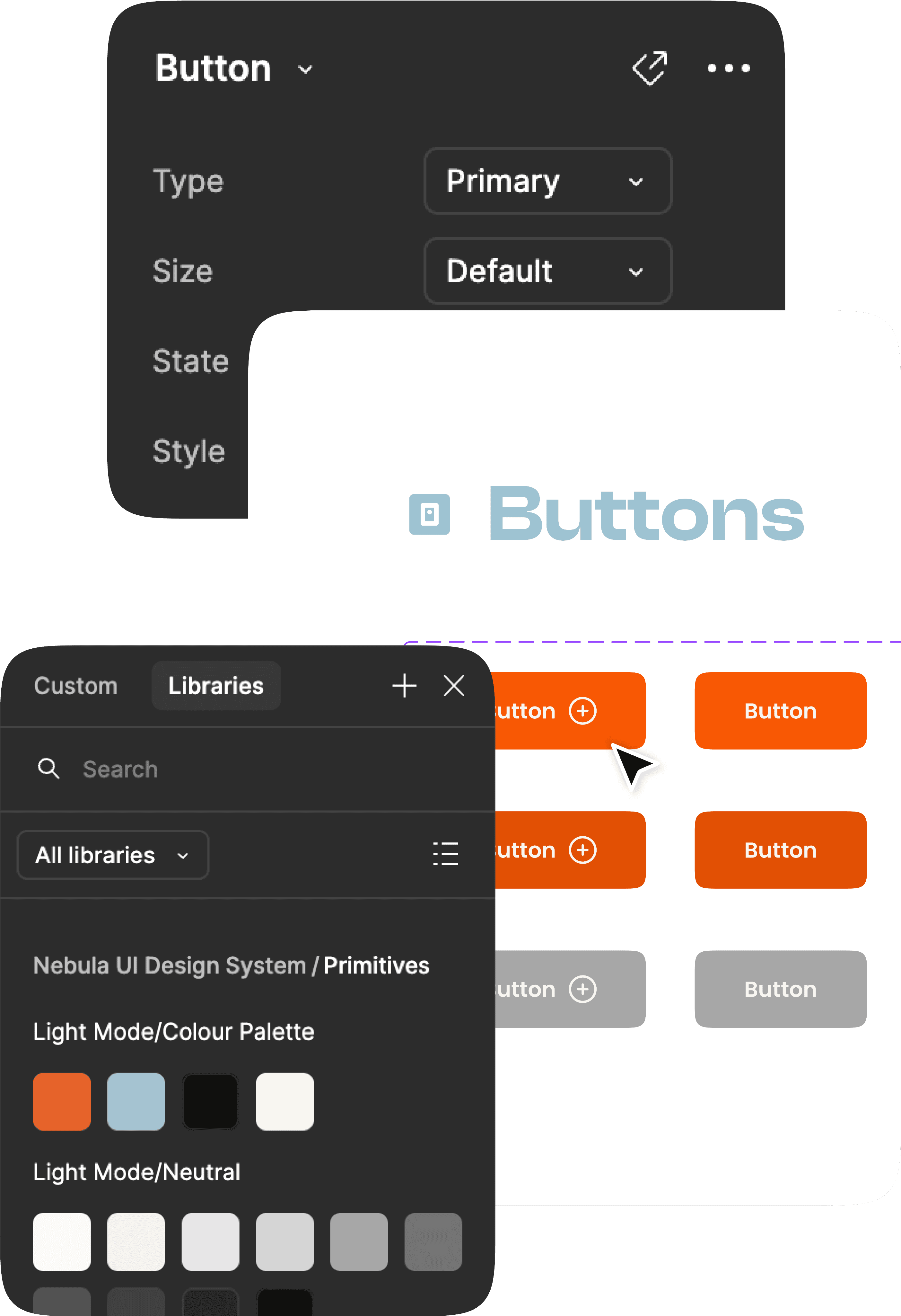
Components
Building a scalable design system in Figma 🎨
08/2023 - Present
Nebula UI is a flexible design system built to make digital product design easier and faster. With its easy-to-use structure and clear documentation, it helps teams create consistent and adaptable user interfaces without the hassle.
Foundation & components

My Role
Web App & Website design
Click here!
Brainstorm ideas
Local styles +local variables
User journey flow
Designing food delivery experience for Zing 🍛
02/2023 - 08/2023
With a vision to simplify food delivery, Zing offers a seamless online ordering experience through pre-ordering, filters, and personalised options.
Deliver Now
HSR Layout 2nd..
Find your perfect food match
Download our
App
Less than a Whatsapp forward
or a Selfie!! Not even an mB.
Join the Cult!
Live Order tracking
Free Packaging
30% OFF, and much more
Download Zing Lite
----------------- 4 Restaurants Near You ----------------
Tasty Magic
0.25 km・North India

Cafe À Paris
1.25 km・Continental

Go Andhra
2.35 km・South Indian
Thar - The Taste...
3.25 km・Indian

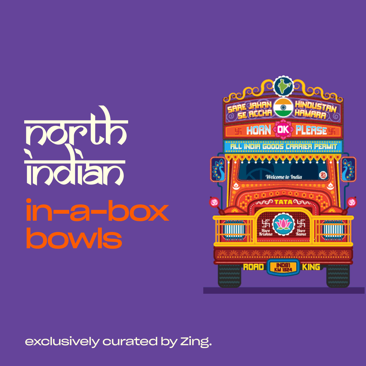
rajasthan
in-a-box bowls
exclusively curated by zing
Tasty Magic
0.25 km・North India

Cafe À Paris
1.25 km・Continental
Home page
Confirmation page
Confirmation
California Burrito
Presidency University • Engineering Block
#291
Drishti Khanna
Good food cooking!
Your food will be ready by 3:00 PM
View on Maps
Call on + 91 9485530203
Download Receipt
View on Maps

Check out my experiments on Figma community! 👩🏻🔬
Click here!
Try it out!
UI screen iterations
i
d
e
a
s
B
r
a
i
n
o
r
m
s
t
my UX work 🧠
designing one pixel at a time
Design System
Nebula UI
Atoms
8
Molecules
10
About Nebula UI
Building a scalable design
system in Figma
Nebula UI is a flexible, scalable, and easy-to-use design system built in Figma to simplify digital product design. It eliminates inconsistencies, speeds up the design process, and ensures a cohesive user experience across projects.
With predefined styles, local variables, and reusable components, Nebula UI makes UI creation effortless—whether you’re building a small app or a large-scale product. Plus, its clear documentation and beginner-friendly structure mean that even new designers can jump in without confusion.
Designed for adaptability, efficiency, and consistency, Nebula UI takes the guess work out of UI design, letting designers focus on creating great experiences.
Brief
Problem
Statement
Designing user interfaces from scratch can be time-consuming, inconsistent, and frustrating—especially when scaling across multiple projects. Nebula UI solves this by providing a structured, adaptable design system that ensures consistency, efficiency, and ease of use for designers at any level. Here’s what you get:
Starting with the smallest elements
Atoms in
Nebula UI
Nebula UI follows Atomic Design principles, meaning everything starts with the smallest elements—atoms—which form the foundation of all UI components.
Each atom in Nebula UI is created using Figma variables, making customisation effortless and ensuring scalability across projects.


When atoms join forces
Molecules
Atoms are great on their own, but when they team up, magic happens. Enter Molecules—small, reusable UI components that bring structure, functionality, and a whole lot of style to your designs.
These are the power duos & trios of Nebula UI, designed to be plug-and-play so you don’t have to reinvent the wheel every time.
Wrapping it up
Why Nebula UI?
Nebula UI isn’t just a design system—it’s a faster, smarter, and more structured way to build interfaces. With its atomic design foundation, scalable components, and built-in flexibility, it takes the guesswork out of UI design.
Whether you're working on a small app or a large-scale product, Nebula UI keeps things consistent, customisable, and easy to use—so you can spend less time fixing inconsistencies and more time creating great experiences.
More than just components
The Learning Curve
Building Nebula UI wasn’t just about putting together a set of components—it was a deep dive into design systems, structure, and scalability. What started as an experiment turned into a well-thought-out system that balances consistency, flexibility, and ease of use.